
Monete
Monete is the ultimate easy banking app. Manage your accounts, pay bills, transfer money, all safely and securely within the touch of your fingertips.

Role
As a finance app enthusiast, I created Monete based on my personal frustrations with existing platforms. I was a designer, UX researcher and strategist in this project.
Duration
2 months (Feb. 2020 - Apr. 2020)
Overview
With current banking and budgeting apps, the data visualization, money transfer services, and itemization features are often disconnected. Monete aims to minimize the laborious work of managing multiple bank accounts, bridging the gap between financial transparency and successful saving tactics.
Team
Personal Project
Tools
Sketch, InVision, Figma, Photoshop
Scope
UI/UX Design, Branding, User Research, Usability Testing
Starting Off
Before constructing feasible user research questions, I focused on the big picture. Who is the primary user? What are their painpoints? How would this app differ from existing banking and budgeting platforms? After my initial interview with 5 users, I identified the two overarching needs: intuitive budget trackers and increasing awareness of achievable long-term goals.

Competitive Analysis
Constructing Monete’s position in the market, I ventured out and conducted analysis of current competitors. I evaluated popular features based on user feedback from surveys and identified missing functions that Monete could possibly utilize.
I found that only two out of the four main competitors offered access to tailored goals, credit score, subscription cancellation, and bills. While Clarity Money and Mint have modern UI and data visualization for users, the interpretation for the goal tracker is limited and unclear. Emma is able to house multiple bank accounts and offer subscription cancellation, but fails to expand on other saving tactics.

The Big Picture
How important is budgeting and saving in general? According to the United States Census Bureau, almost 60% of all working individual do not own assets in a savings accounts. The pattern is especially prominent among the millennial niche aged 21-34.
With this in mind, it became clear that maintaining a budget is increasingly difficult. While a wealth of money management apps target the labor-intensive process, only a few are all-encompassing and goal-oriented.
Source: United Census Bureau, SIPP, 2014 Release


Prioritization Plotting
Based on the data collected, I plotted a list of potential features. I was able to narrow down and focus on what is vital to the success of the product. I also came up with a few features that we could build in the future.
The overall user feedback speaks for the need of financial guidance and planning. Diving right into the pain points, Monete links authorized bank accounts, transfers money, and provides wealth management tools,
Painpoints

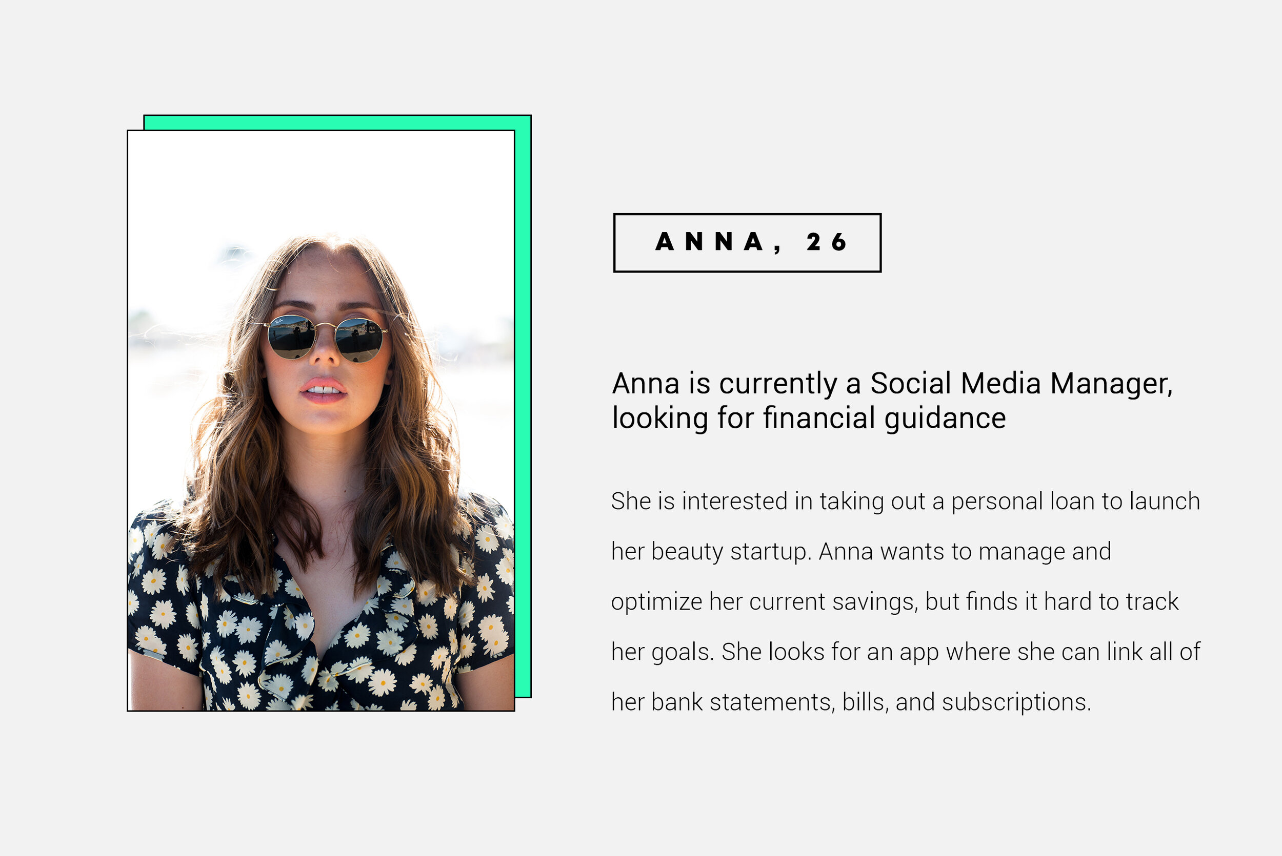
Meet the Users
To really get a feel for the target users, I created personas based on the millennial niche so that I can jump into the users’ shoes and really uncover their needs and prioritized features.


Information Architecture

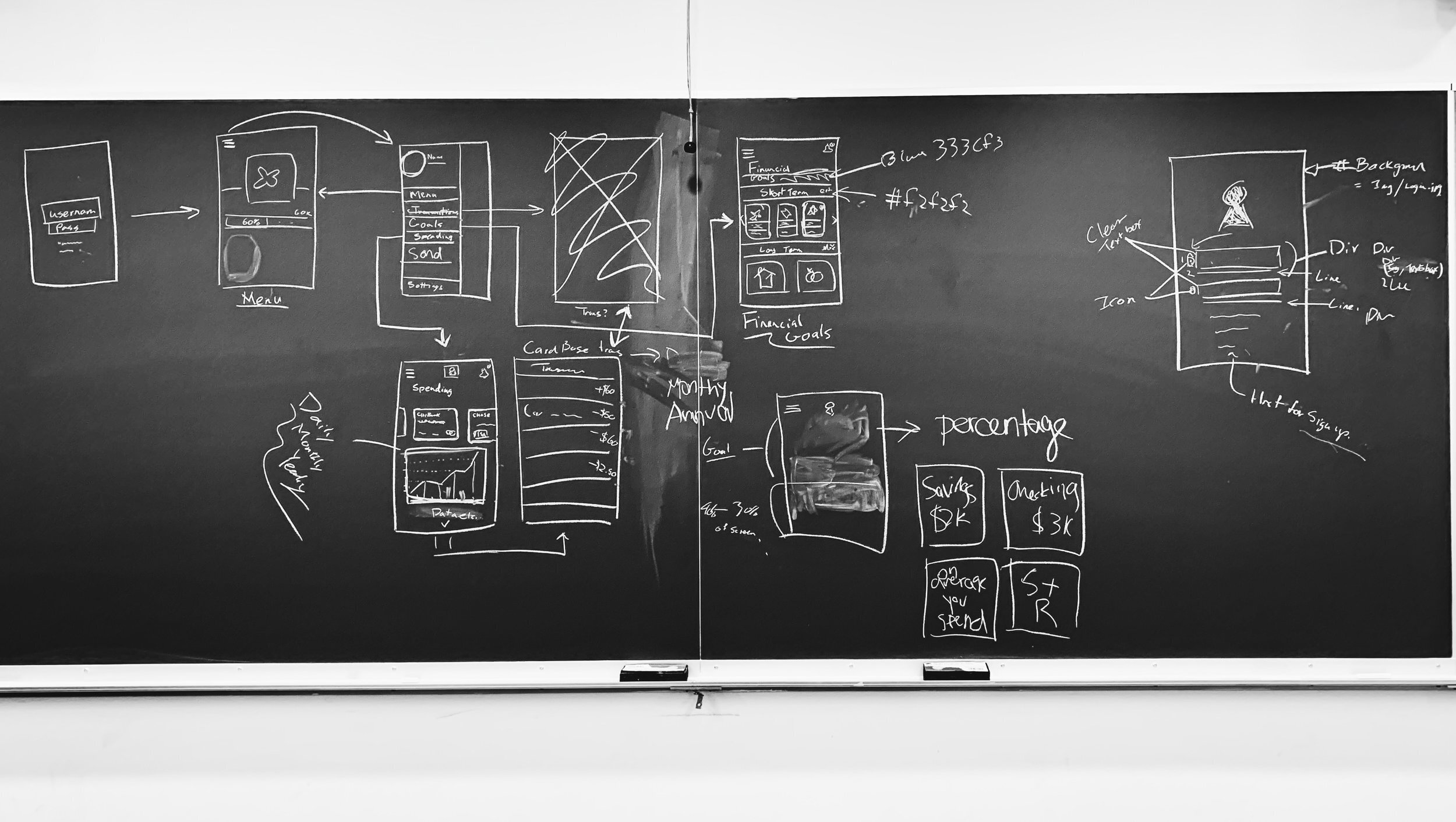
Low-fi Wireframes
Before embarking onto preliminary user testing and high fidelity mockups, I brainstormed on potential UI designs, illustrating wireframes to get a feel for the app and its core features.

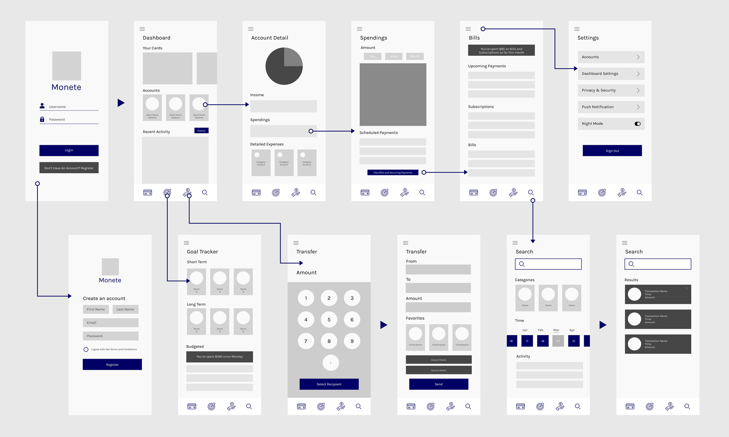
Wireflow
With this flow in mind, I went on to create the digitalized mid-fidelity mockup on Sketch and InVision. I sent out a Beta version to 25+ students at Columbia University.
Beta Testing
After sending out the beta version, I found out that a lot of the features were unused. Overestimating the Search tab, I could potentially narrow down Monete to only three main functions through Transfer, Dashboard, and Goal Tracker screens.
Although users did not utilize the search feature, I decided that it could be still be useful for itemization. The tags from the categories can be integrated with the Goal Tracker page for easier overview of where the money is going.

I also found out that the money transfer feature between friends was widely used. People seemed to like the social aspect and enjoyed the convenience of the “Favorited” profile section. In terms of the Dashboard, I plan to give the Bank Account overview more visual impact. Users also love scrolling through Short Term Goals in the Goal Tracker screen. Perhaps, saving up for a tangible future heightens the motivation and anticipation for users.

Interaction Decisions
How do I make it intuitive for users to switch between credit cards, profiles, and bank account overview? I prototyped 3 different types of interactions and tested them with the users to find the easiest one.

Findings: In the user testing, three users found the vertical scrolling labor-intensive and the circular motion unclear.
Based on the results, I decided on the horizontal swipe and iterated on the original wireframes. With these design decisions in place, I was ready to create the full prototype.
Hi-Fi Interfaces —

CHALLENGE 1: SEAMLESS NAVIGATION
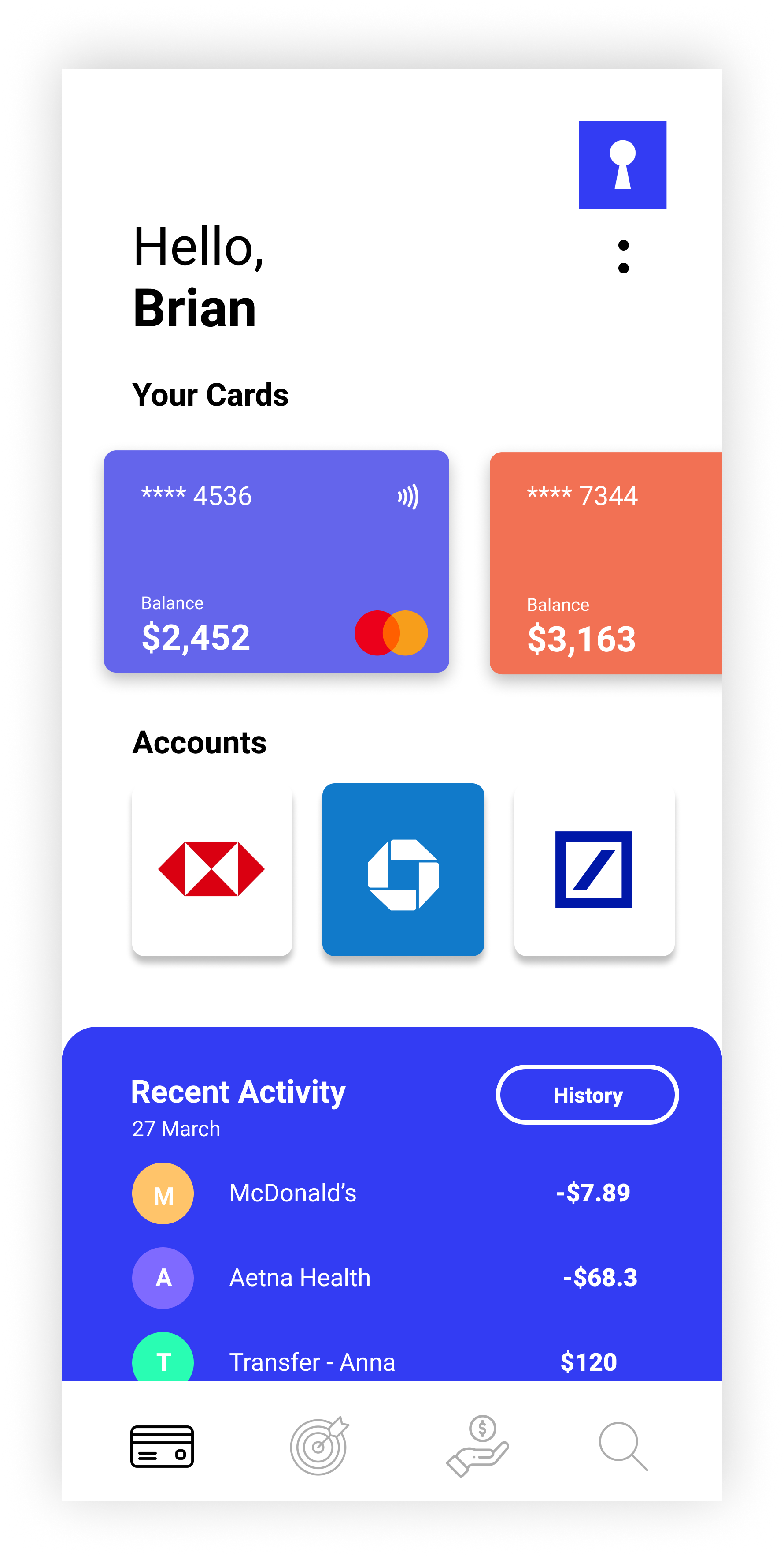
Dashboard
To ensure the users receive the most important information at first glance, I wanted to establish a familiar navigation that is most intuitive. Placing a “History” button within the bottom collapsible allowed me to create a bridge between an overview of recent transactions and detailed itemized statements.

CHALLENGE 2: DETAILED CHARTS
Visualizing Data
Crafting readable charts and data visuals are key goals of the project. The design aimed to organize complex data through the timeline sub-navigation. Utilizing comprehendible graphs, I accelerated the labor-intensive process of reading through expenses.
CHALLENGE 3: SETTING EXPECTATIONS
Goal Tracker
When people save up for future goals, what are the most important elements that keep them motivated? A lot of the time, users don’t know how far they are in the process and lose track of their budgets. By creating a divide between Short Term and Long Term goals, the app holds users accountable and encourages organization.


CHALLENGE 4: SUBSCRIPTION CANCELLATION
Smart Savings
With AI integration, Monete organizes accounts with automated expense tracking. The smooth UX of the interface allows users to cancel subscriptions with one tap. With the help of different saving strategies, users can control budgets and monitor their financial health.
Interaction Design


Created through Sketch + Figma
Style Guide
The color palette utilizes bright and neon tones - a perfect fit that echoes the taste of the targeted millennial niche. Dark and monotoned colors balance out the vibrant interface, contributing to a formal visual impact.
The main typeface for the app is Roboto. I feel like the typeface is compatible with Monete’s emphasis on data visualization, creating versatile contrasts between uppercase and lowercase styles.

Retrospective
Creating an app from scratch as a designer is super rewarding. I got the experience to compile research, conduct interaction testing, and craft high-fidelity interfaces. Through the process, I realized a great product needs to be buttressed by qualitative data, clear user flow, and lots of user feedback.
Utilize different tools in different stages
I learned to beta test with InVision and integrate the feedback into the final prototype with Sketch + Figma
The ideation process requires users early on
Feedback I received prior to the first usability testing helped me immensely with identifying tangible goals. The user stories and researches certainly contributed to a smoother design journey.
Designing is fun
I love talking to people about buttons and scrolling interactions. As a critical thinker, it is super cool to witness the steps it takes from conception to completion.