
KettleSpace UX Design Internship
New York-based startup KettleSpace partners with leading hospitality brands to create a network of on-demand coworking and meeting spaces during their downtime. I was a UX Design Intern in the Product Team for Spring 2020.

Role
I worked as a UX Design Intern at KettleSpace cross-functionally on the Product Team and Engineering Team.
Duration
4 months (Jan. 2020 - May 2020)
Overview
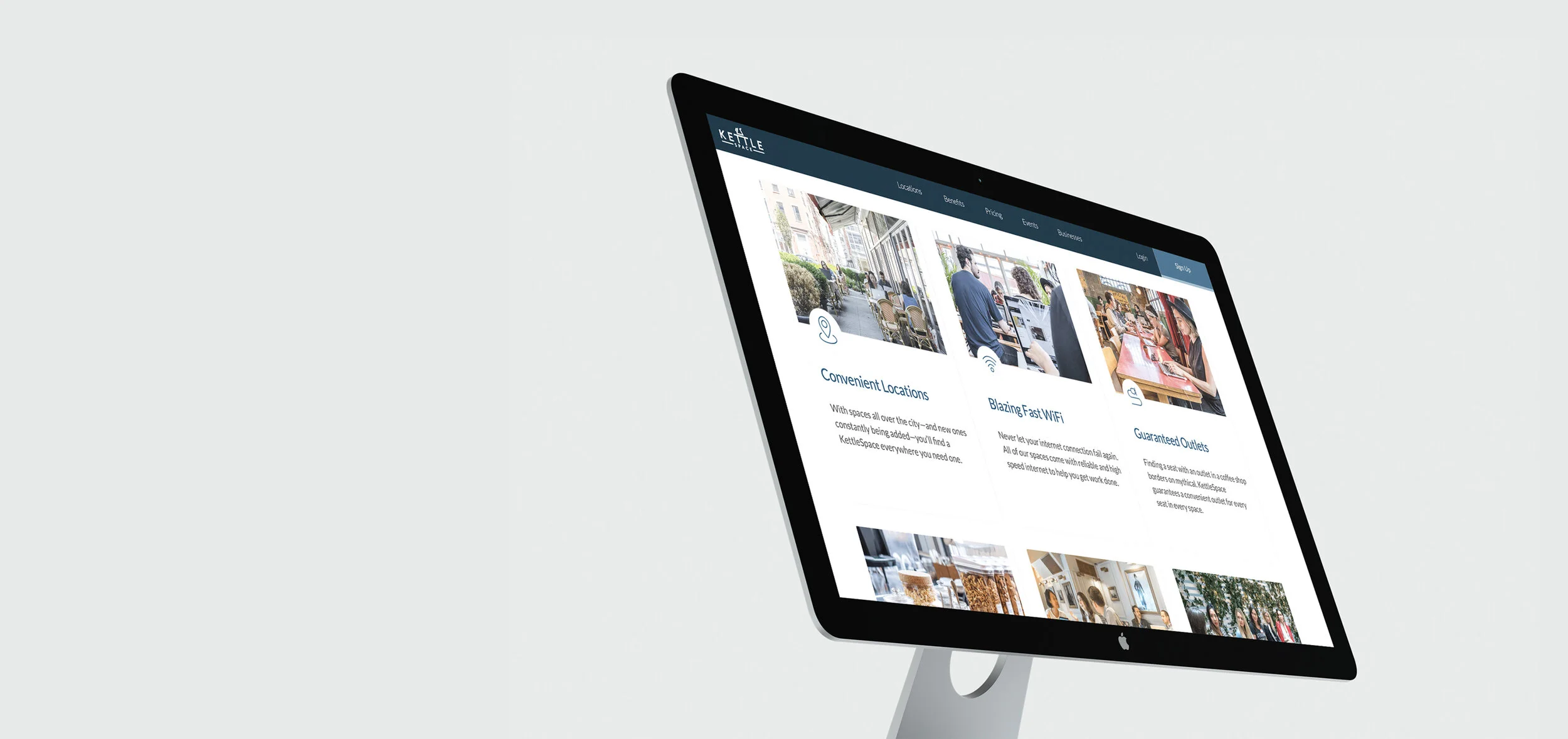
With 1 engineer, 2 product managers, and a remote UXD team from CoLab LA, I designed and shipped an onboarding modal that helps hundreds of KettleSpace trial users to access dashboard, location services and benefits with ease.
Team
Product Managers: Josef Katz, Chino Azcue
Engineer: Ammar Mian
Tools
Figma, Sketch, Jira, Zeplin
Scope
UI/UX Design, Visual Design, Research, User Testing
Goal
KettleSpace’s trial membership process has been lacking some features and follow-through. The goal of the project was to design a new onboarding flow, which better understand how to engage past the Sign-up stage and create a higher conversion rate for trial users to become paid members.

Challenge
When KettleSpace launched its 7-day free trial in Fall 2019, the MAU in 16 Manhattan and Brooklyn coworking spaces skyrocketed. However, the rise soon hits a plateau and started dropping as many trial users quit after the subsequent first month of discounted membership.
This was because trial users do not receive much guidance after the initial subscription process. They were basically left of on their own to discover KettleSpace spaces and benefits.
Ideating a onboarding modal with tailored questions and interactive map API, the team hypothesized that trial users will find the experience more engaging and personal, thus visiting more spaces earlier on in search of their ideal coworking location. My task was to design this onboarding feature.

User Goals
The team was trying to find out a question on Trial-to-Purchase Conversion: If new leads and trial users know what to expect and are guided to the most productive trial week possible, are they more likely to convert to paying members?
To better understand our users, the team interviewed with 11 people of different professions, aging 21 to 35. The interview is structured with open-ended questions to make sure people share all aspects of their coworking habits and pain points.
From the interview, the team found out that there is a lack of expectation before trialers show up for their first visit. Professionals, especially those who are not tech-savvy find the physical onboarding process confusing and often failed to show up to coworking locations after their initial experience.
We identified three key goals trial users seek for when starting out:

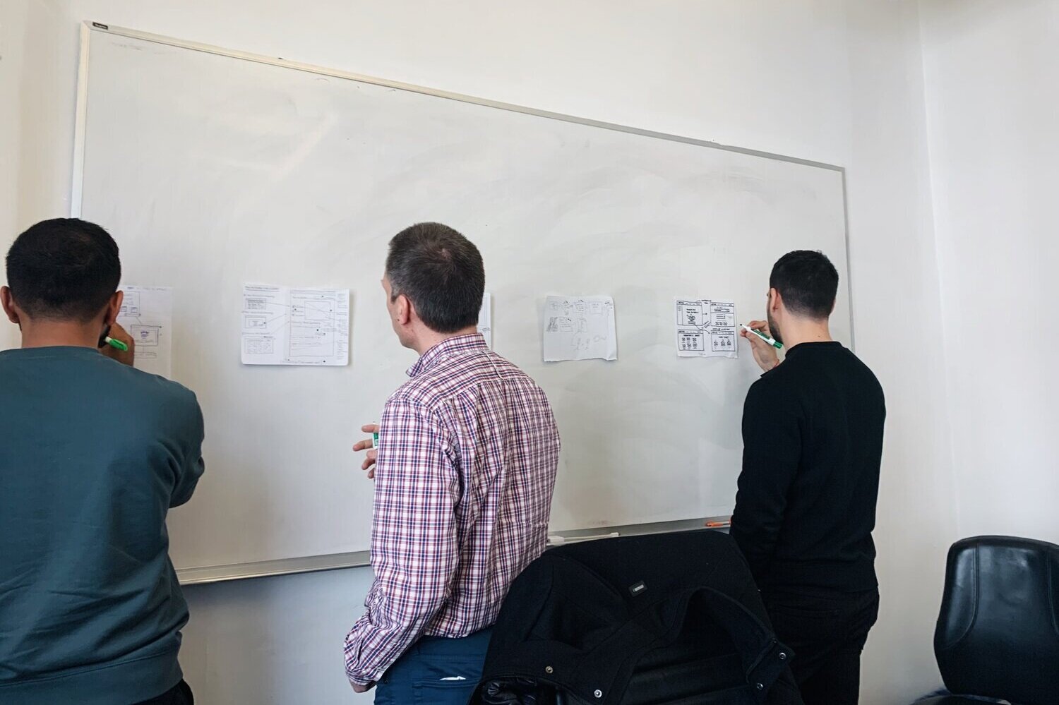
Whiteboarding
Gathering my project managers and engineer, I drew explorations on the whiteboard and proposed a redesigned sign-up and onboarding flow. Utilizing the timed sticky decision method, the team outlined varying solutions and quickly discussed design highlights. We then converged all the ideas and formulated into the low-fi wireframes.


Low-fi Wireframes
Onboarding Introduction
Clear information architecture for user’s eyes to focus on the center
Emphasized “Start” button and a less-prioritized “Skip” feature on the bottom right.
Featuring a profile from KettleSpace’s community manager to make the onboarding more personal
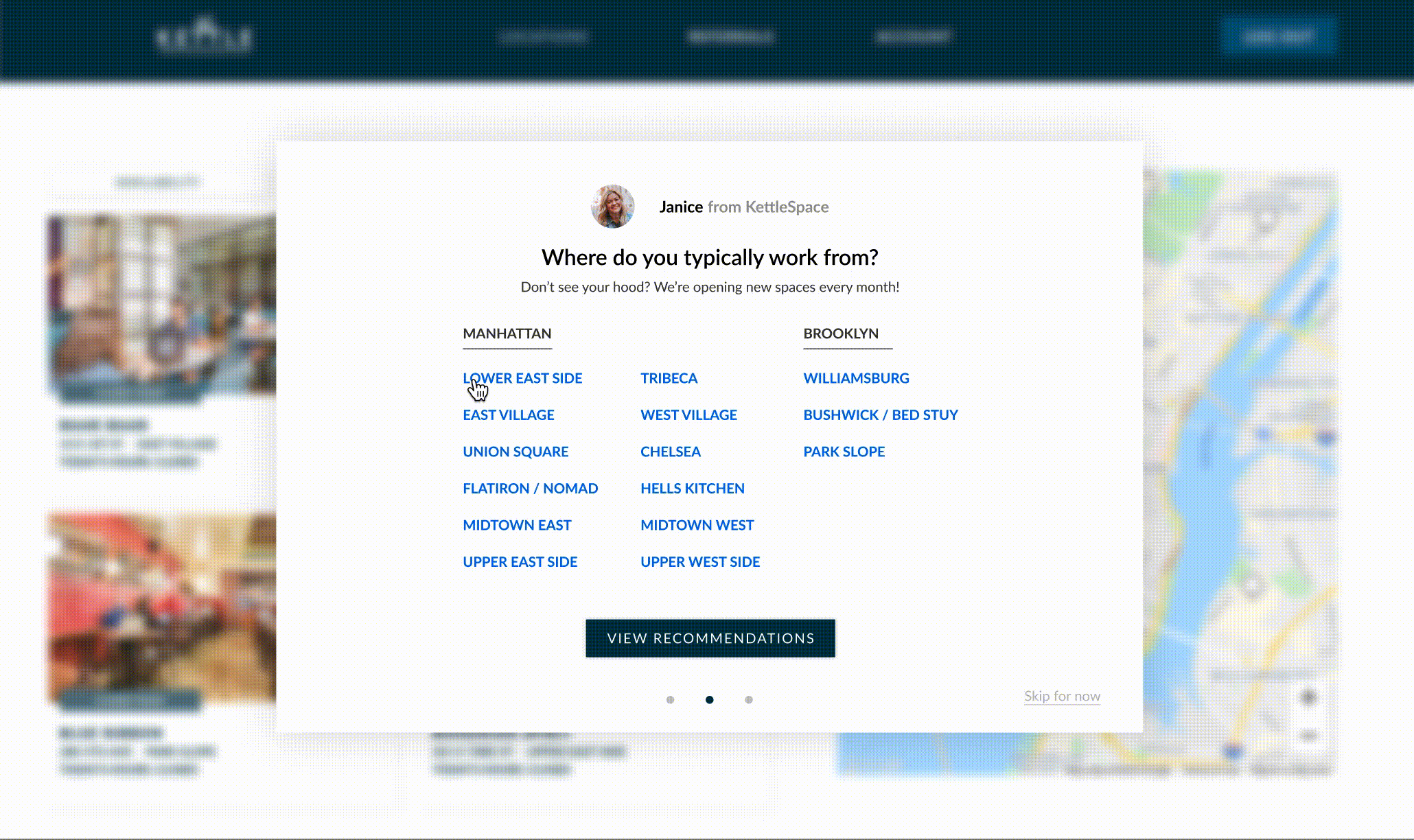
Tailored Experience
Option to multi-select in different categories
Concise summarization of key features of coworking spaces
No option to select less than one in each column. We want the recommendations to be precise.
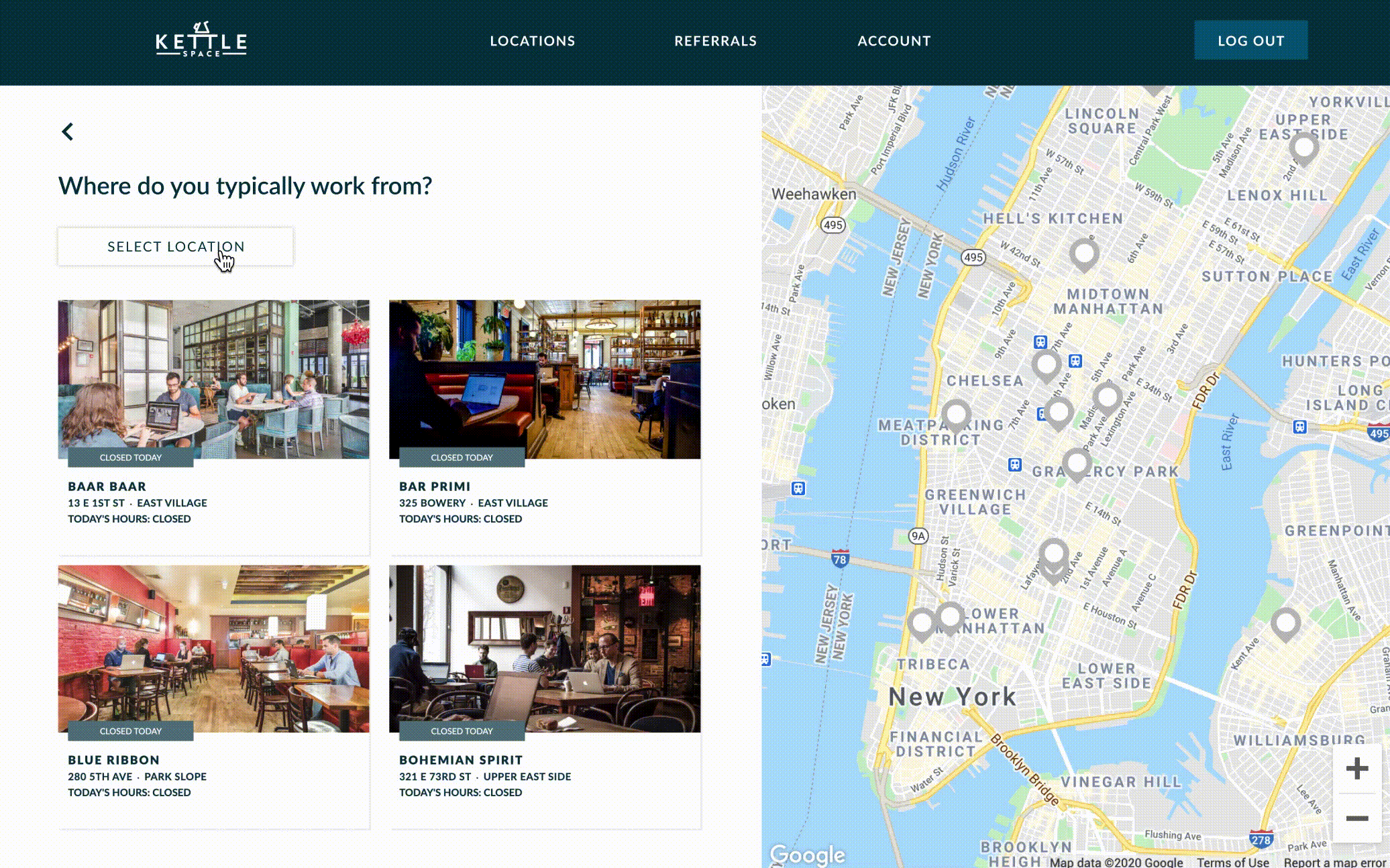
Quiz Results
Interactive map with location hover
Experimenting with edge cases, I made sure that the split screen would show the map in the correct dimensions even with super short length and super long width
Explorations
Utilizing heuristic evaluation, I identified key issues with the existing sign-up flow. Synthesizing research results from heatmaps and user interviews, I found out that there is a lack of information given for trial user’s first visit.
Through browsing Hotjar’s visitor recordings, the team discovered that 95% of the users clicked on the “Location” tab after they completed the initial signup, yet 28% of them started dropping off at the page due to the inefficient onboarding and location recommendations.
Based on these results, I decided to A/B test the “Select Your Location” screen in the new onboarding flow.
Exploration 1
There is a clear deselect process, however, the user’s eyes are forced to go back and forth with a distracting background. The dynamic “Community Favorites” recommendations seems redundant with the final quiz results.
Exploration 2 🏆
This design displays a selection process with minimal eye movement and is consistent with the interactions of previous screens (working habits and space preferences). The blurred background prioritizes the onboarding architecture.
86% of the tested users preferred this screen over Exploration 1.
Implementation
After flushing out the details of the low-fidelity prototype, I spent weeks working through the details of the UI with my mentor and product managers. Working with the dev team to deliver the product, I wrapped up the design handoff with Zeplin. Taking the time to clarify complex flows, I created a high-fidelity prototype to help engineers uncover some key user interactions.

Design Solutions
Due to the NDA, I can not show the process of the high-fidelity prototype, but here are some final screens for the trial user onboarding flow.
Personalized Onboarding
The onboarding offers a tailored Q&A experience, allowing users to select their ideal coworking location. By including a headshot from the KettleSpace support team makes the experience immediately welcoming. The contrasting color of the “Let’s Do It” button prioritizes the primary action and encourages user to dive into the quiz.
Finding The Perfect Space
Based on the interviews insights, we want the trial users’ first in-person experience to meet their highest expectations. With the detailed filters for location, ambience, and amenities, we can make informed and accurate predictions based on algorithms.
Fit for Digital Nomads
72% of existing KettleSpace members are flexible freelancers and resolute remote workers. The startup’s network of spaces allow people to drop in whenever and wherever they want. It is essential to allow users to multi-select neighborhoods they are interested in working at, providing them the flexibility to work around the city between meetings.
Building Community
We seek to give scaling startups and mobile workforces a comfortable place to do work. With the integrated map API, the users can easily browse through a variety of KettleSpace’s locations. The onboarding quiz results will take in account of the personal preferences, whereas the curated “Community Favorites” section highlights our best spaces in the hopes of offering the trial users a perfect first visit.
Retrospective
Embrace ambiguity
Instead of diving straight into the prototyping process, I learned to be patient and break down research questions. Our most valuable insights came from the afternoons spent interviewing users and whiteboarding. The specifics of the flow started piecing together as we used data to back up our design decisions.
Going remote
My in-person internship came to an abrupt end when the coronavirus pandemic hit in March. Feedback and usability testing became challenging as the team was handling a drastic shift to an online work environment. Battling Zoom fatigue and Slack exhaustion, I became more cognizant of efficient task organization, rapid prototyping, and clear communication.
Have lots of fun
I ended up bonding a lot with the PMs and my mentor. While the dev team eventually implemented ~70% of my designs, I still loved the opportunity to participate in early product cycle and putting the user’s voice first.