
Spotify Stories
Access your friend's listening activities and share what you are currently playing on Spotify Mobile.

Role
Since the day I sneakily joined Spotify Premium with my mom’s credit card, I have been obsessed with it’s sleek interfaces. This was a personal project, where I was a UX researcher and designer.
Duration
1 month (Dec. 2019)
Overview
Spotify has transformed the ways people access, listen, and produce music, reshaping the landscape of the audio streaming industry. While Spotify is known for its highly tailored recommendations and eclectic music variety, what truly differentiates the company from competitors is its social focus. I helped design a Spotify Story feature where users can access friends’ listening activities easily, increasing social engagement with the app.
Team
Personal Project
Tools
Sketch, Figma, Photoshop
Scope
UI/UX Design, User Research, Usability Testing
The Problem
“I can’t see what my friends are listening to on my iPhone…”
On Spotify’s Desktop app, users can access their friends’ listening activities through a sidebar.
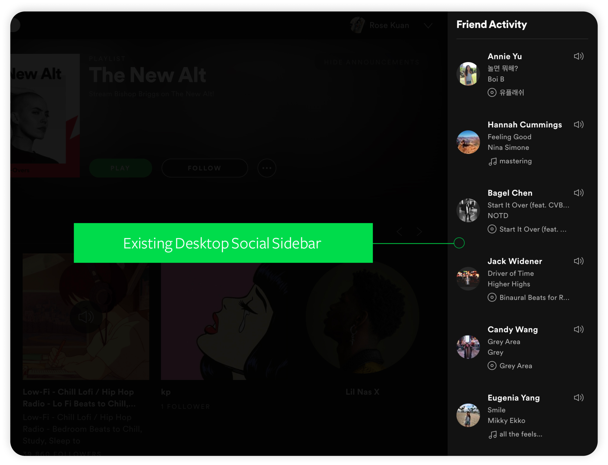
This feature encourages a social experience, where users can find insights into their friends’ music tastes and share their own. One of my favorite things to do when I first open the Desktop app is to scroll through my friends’ listening activities and look for interesting choices. The Friend Activity feature is like no other and distinguishes Spotify from other streaming services.
I want to bring this fun and distinctive feature onto the Spotify iOS app.
Spotify has not implemented the Friend Activity feature on its mobile applications. In fact, many users have reached out requesting the addition of the feature on mobile. Since its first suggestion in 2015, the idea has received over 4,000 votes. However, it seems like Spotify is adamant on its stance, keeping the idea to “Not Right Now”.

It is clear that Spotify has considered the idea and decided not to include the feature on its mobile app. Whether or not Spotify implements a similar feature in the future, I believe the addition of a social feed can increase the retention rate on the app, as well as consistency to the overall user experience. Since the sidebar is an essential feature in the Desktop app, the mobile app should also follow a similar experience pattern.
In addition, I would love to explore possibilities with the feature and implementing data from Friend Activities into playlist recommendations. The app currently offers song recommendations based on existing songs in a personal playlist. I wanted to diversify the variety by incorporating the option to view friends’ past listening activities, where users can find and receive playlist recommendations quickly via Spotify Story.
The Goal & Objective
To increase social engagement within the App by implementing the Friend Activity feed and Similar Playlists by Friends feature.
“How might we’s”
How might we make the Friend Activity feed more engaging, increasing the time users spend on the app?
How might we make this more of a seamless experience, corresponding to the user experience of Spotify Desktop?
How might we get people to feel more excited about exploring playlist recommendations?
User Research —
On approaching this problem, it was crucial to gain a better grasp of how Spotify users’ routine and interest in using the app.

The hook is an experience designed to bridge the user’s problem and the solution.
The current Spotify app follows a HOOK model, found in Nir Eyal’s theories on customer behavior. HOOK consists of four parts — Trigger, Action, Reward, and Investment.
A Trigger is a cue that causes an individual to take action. There are two types of triggers: internal triggers are emotions such as loneliness, boredom, and insecurity, whereas external triggers can consist of friend recommendations, messages, and the current weather.
The Trigger → I want to listen to some music and see what my friends are listening to
An Action takes place after the trigger. Action can include scrolling, listening, refreshing, and playing within an App.
The Action → Opens the app, views the friend activity feed
The Reward is the user’s desire, taking the form of happiness, information, recognition, and acceptance.
The Reward → Find what your friends are listening to
An Investment is what users are willing to do for further rewards. In Nir Eyal’s argument, repeated rewards contribute to increased investments — whether time or monetary consumption. In a sense, investments can drive future benefits including money, effort, and time.
The Investment → Scroll through the friend feed and click on individual profiles, spending more time on the app
The Fogg Behavior Model reveals an inverse relationship between motivation and ability. When the action is complex, users require more motivation. Thus, it is important to make the minimum action (in this case: accessing the Friend Activity feed) as effortless and quick as possible for the users.
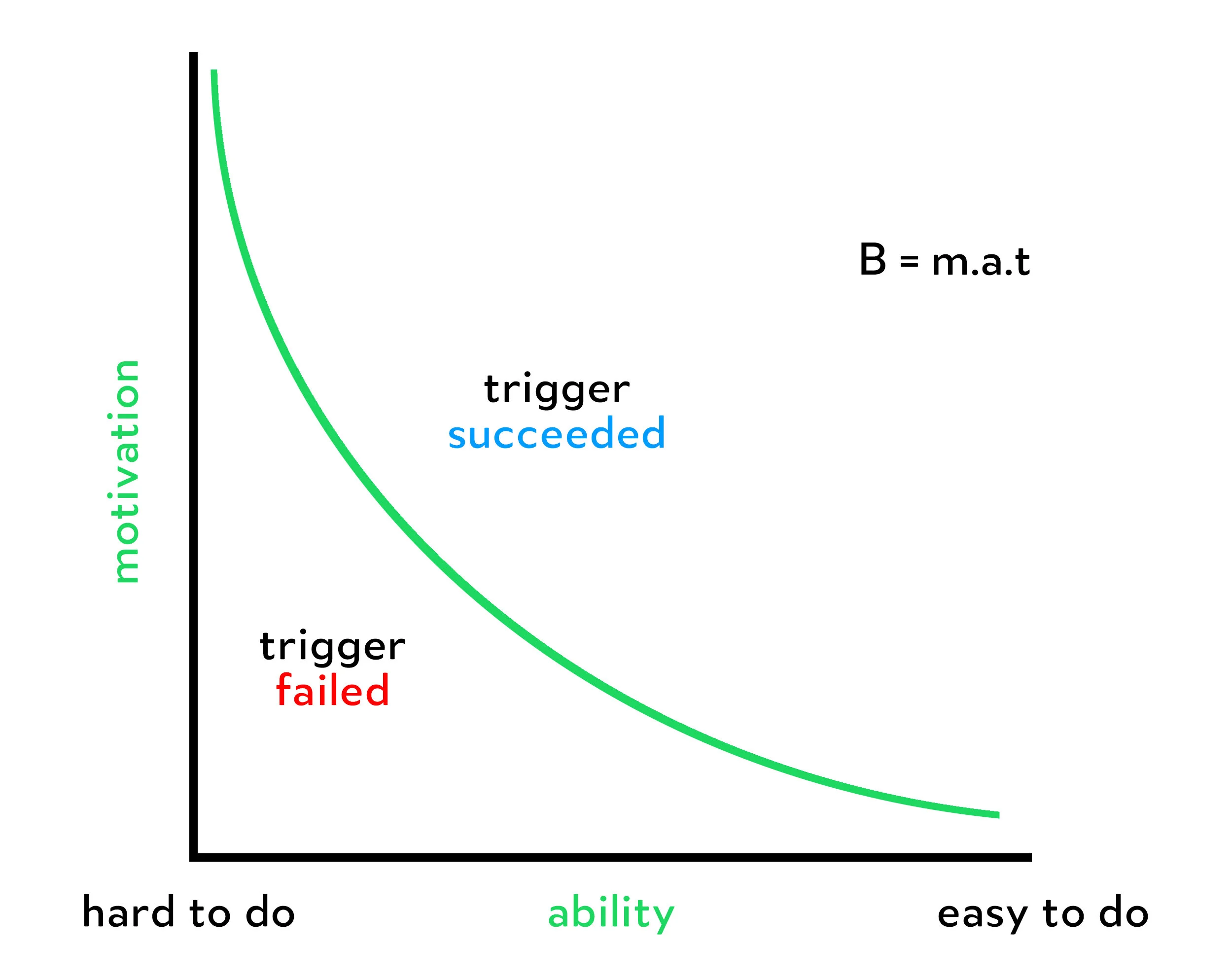
Ventures often underinvest in easing the minimum user action while over-invest in attempts to increase motivation.
What is the most minimum action the user takes in anticipation of a reward — finding what their friends are listening to?
How can I minimize the effort required to take the intended action?
Spotify has crafted a near-ideal habit loop… I want to know how I can enhance it further.
I conducted 9 interviews with individuals who use Spotify and had several conversations with casual Spotify users. My goals were to:
Understand how users make listening choices
Discover the Spotify elements that loyal Spotify users care the most about (music variety, the design, playlist recommendations, Desktop Friend Activity feed, etc.)
Affinity Diagram

User Research Takeaways
Key Findings
Spotify users use the streaming app not only for listening to music but also for discovering new music.
Users like to stay organized and categorize their favorite songs
“I create a ton of playlists depending on my moods. Sometimes my playlists are just a note pad filled with random songs my friends recommended me.”
Users stick to a singular app when listening to music
“I use Spotify instead of Apple Music for its sleek design and interesting stats. I love looking at artist profiles, reading through the monthly listener numbers and locations.”
The Friend Activity feature is immensely popular
“My favorite part about Spotify Desktop is the Friend Activity Feed. I like to look at what friends are listening to and find new music.”
Users really trust Spotify’s curated playlists. They like to explore music through their playlist recommendations and find similar songs.
Personas
Empathizing with the Target Niche


Casual Spotify User — Arthur
Relies heavily on friends’ recommendations and likes to use Spotify to browse for trending music
Enjoys music, but is unaware of all the social features and stats on the app
Moderate Spotify User — Lizzie
Likes to listen to music and find what her friends are currently raving about
Follows up and coming artists and keeps up to date with popular Spotify playlists
Loyal Spotify User — Kevin
Extremely passionate about making music and always exploring for new artists
Loves sharing his listening activity with his followers on Spotify Desktop
Through the exploration of the three personas, I identified an overlapping pain point which the current Spotify Mobile lacks — an active social feed. Whether they are casual, moderate, or loyal users, people are interested in engaging with their friends. These personas are crucial to the development of my design decisions, so I made sure to always refer back to their needs.
Exploring Solutions
Brainstorming Low-Fi wireframes

During a hour-long sketching session at 1 AM, I brainstormed low-fi wireframes to translate the Friend Activity feed onto Spotify mobile. The feature could solve the lack of social engagement within the app and create a more integrated listening experience.
Home Screen
Users can scroll through their friends’ icons to find what they are currently listening to

Changing the Current Song Pop-Up
Adding the “Friend’s Profile” component to the song pop-up

Mid-fi mockups
Design Decisions — Implementing the Desktop Friend Activity Profile onto the Mobile version
First, I started by dissecting the existing Desktop Friend Activity Profile into its essential parts.

The current Desktop Friend Activity Profile consists of: the friend’s name, song title, artist, how the friend is listening to the music (either through album or playlist) and timestamp. Spotify Desktop emphasizes the interactive experience with the Friend Activity profile, for instance, when you hover over Kevin’s icon, you have the option to play the song he just listened. With the personas’ needs for social engagement in mind, I believe it is crucial to retain the original five components and the interactive aspect in the translated Mobile version.

I lined the individual Friend Activity profiles in a row and implemented it at the top of the current Home screen, following the same format as Spotify Desktop.
User Feedback
COMPLEX VISUAL
Users mentioned that the design is cramped. The social feed is complicated and seems out of place. I would want to introduce a simpler interaction design to reduce any friction in viewing friends’ activities.
SIZE
The social feed occupied a large chunk of screen space. When I asked if the users care more about the friend’s name, song title, artist, album, playlist, or timestamp, they were adamant that the album and the playlist labels were the least relevant.
Users requested a quick way to click into their friends’ profiles and the songs they are currently listening to.
CONTENT
One user suggested an accessibility feature to increase the font size of the song and to remove the listening source.
Another user found the icon unnecessarily large, occupying a serious amount of space.
Users mentioned that the inclusion of a timestamp would make the activity feed more interactive, however, it could further complicate the spacing.
It is evident that my initial assumptions of translating all the components from the Desktop Friend Activity Profile do not work. The mid-fi mockup revealed a confusing interaction design, where users cannot identify the prioritized feature.
Shifting Gears
I began to pivot my design process by searching for the best social feeds. It is important to figure out what features I should show and chose to omit. Looking into popular social media platforms such as Facebook, Snapchat, and Instagram, I realized that minimal design is key to a successful activity feed. I could potentially save space by moving the original content of the Desktop Activity Profile into a different screen, i.e. including the content into the song detail popup.
I find Instagram’s story feed the most simple yet engaging among its competing platforms.

I saw an opportunity in emulating a similar story feed like Instagram, which shows the two fundamental information — user icon and name. By limiting the details shown on the Home screen, the activity feed no longer occupies a large amount of space and the core information is prioritized.
Instagram uses color outlines to differentiate between personal story and friends’ story. I sought to use the outlines as timestamps in the Spotify social feed, where the green color indicates current listening activity and the grey color indicates past listening activity.

If a user decides to go into a private session, his or her profile icon will indicate the status by including a lock.

In this iteration, only the profile icon and name are present. If the user is interested in watching all friend activities, the feed would just play continuously.

Placing the simplified profiles into a row resolves the cramped screen from the mid-fi mockup, offering users a more seamless transition between different listening activities.

The translated row component takes up less space and reveals the most important information (icon, name, and listening activity status) with a minimal design.
Designing UI/UX
UI Design Decisions
Once I finalized the Friend Activity row, I wanted to focus on the popup screen. When a user taps on a profile icon, a screen would show in a similar motion as the current Spotify song detail popup. The popup is an efficient method to organize necessary information of the song, in addition to those that cannot fit in the home screen display. I based my redesign on the current song detail pop up from Spotify Mobile.
The current song detail modal includes navigation for both social and personal functions. I want to enhance the detail screen by incorporating the “Spotify Story” aspect, where users can view their friends’ listening choices. Since our users are exposed to the original Spotify Mobile screen, following the established layout would be the most fitting.

Redesigned Story Screen — First Iteration

I decided to design multiple versions of each interface to indicate the active, inactive, and private listening status.
Based on the task flow and current Spotify UI, the detail screen retains in-depth options for the particular song. Here, I asked the users. Most of them prefer a simpler interface, without the complex options. Some users mentioned that the inclusion of listening history can make the app more engaging
“I think the song details and functions are quite distracting. I just want to know what my friend is listening to and then decide whether I am interested by the music choice.”
“A play function would be nice so I can immediately listen to the song.”
“It would be interesting if we can see past listening activities, instead of only the most recent song choice.”
I took the above feedback and iterated on the screen, following Spotify’s design system.
Redesigned Story Screen — Second Iteration

Instead of cramping the screen with listening history, I decided to minimize the design and hide further functions within the rewind icon on the top right.
Here, I went back to our persona. Our target user group is those who look for a social experience, by which song recommendations should be accessed within a few clicks. I kept the three most popular functions (add to playlist, add to queue, and share) so users can make intuitive navigating choices.
The story screen also becomes more accessible with the enlarged album cover, like option, and the play button.
Past Listening Activity Popup

On-tap of the rewind icon, this screen would show as a detail popup. The list consists of past listening activity with infinite scroll. If the user is interested in a particular song, he or she can click on the three-dot icon for further functions.
Refreshing Friend Activity

Emulating a similar design as Instagram, I wanted to create a refresh interaction, which reloads the story feed data. The user can update their current friend activity anytime they want with a simple pull on the home screen.
Retrospective
I started this case study after finding a common blindspot in listening trends among my peers. People have a tendency to stick with cyclical listening habits, constantly rewinding playlists and songs based on personal preference. While most get bored of the loop, searching for new music could be a tedious task. Considering the larger user base on Spotify iOS, translating the Friend Activity feed could potentially make the browsing process fun and engaging. The core idea is to create networks between friends, sharing their playlist circles and ultimately building joint circles together.
If I had more time, I would have definitely incorporated the comments from my users to create an even better experience.
I would want to track metrics such as story clicks, direct links to friends’ past listening activities, and the number of queued songs referred from the story feed.
Other ways to measure success include:
More usability testing: at which points are the users exiting the story feed?
More user feedback: what are users’ behaviors and opinions?
Traffic analysis: how are the users interacting with the new story feature?
A/B testing: is this story feature really effective in increasing users’ likelihood to listen to new music?